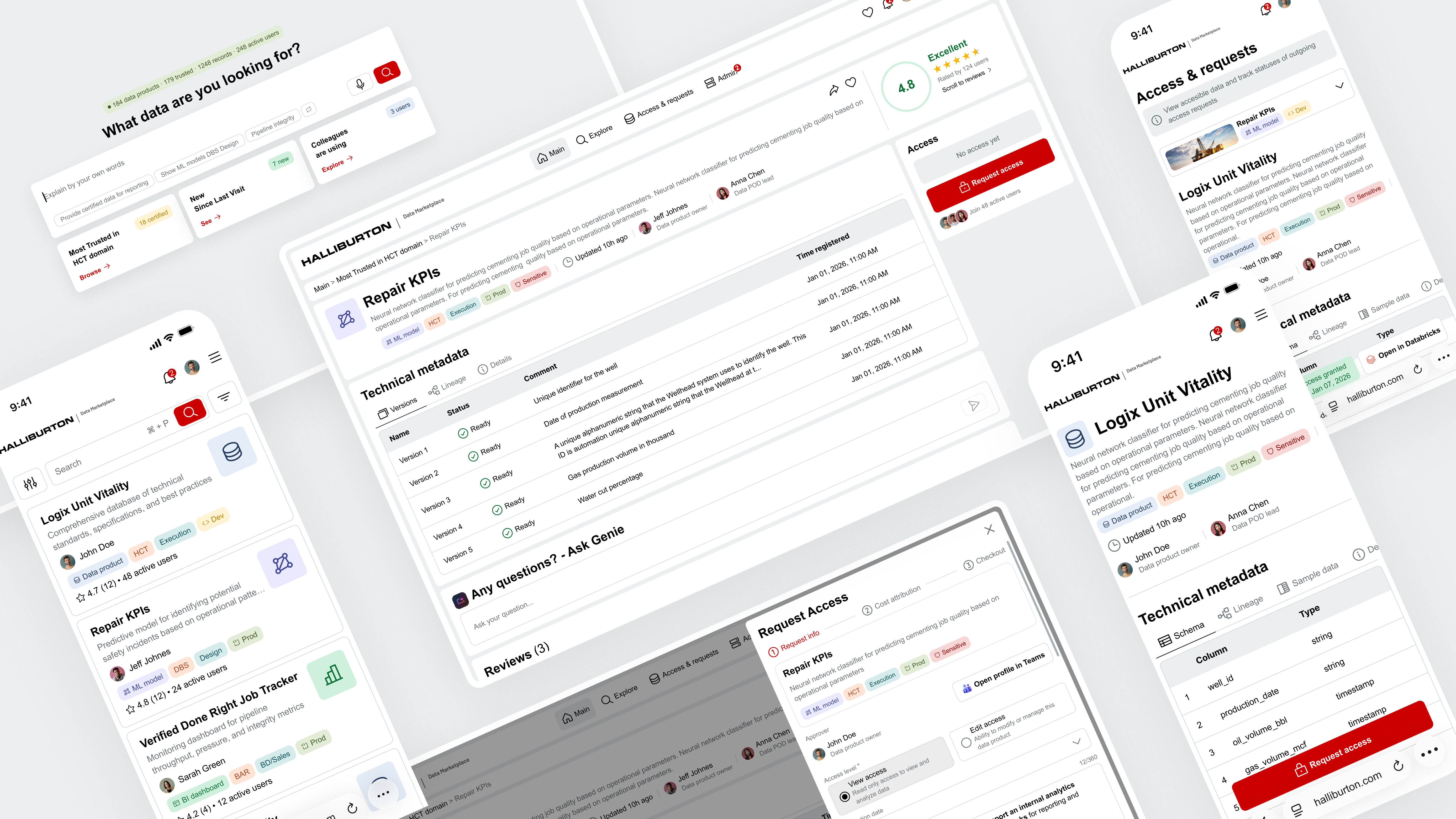
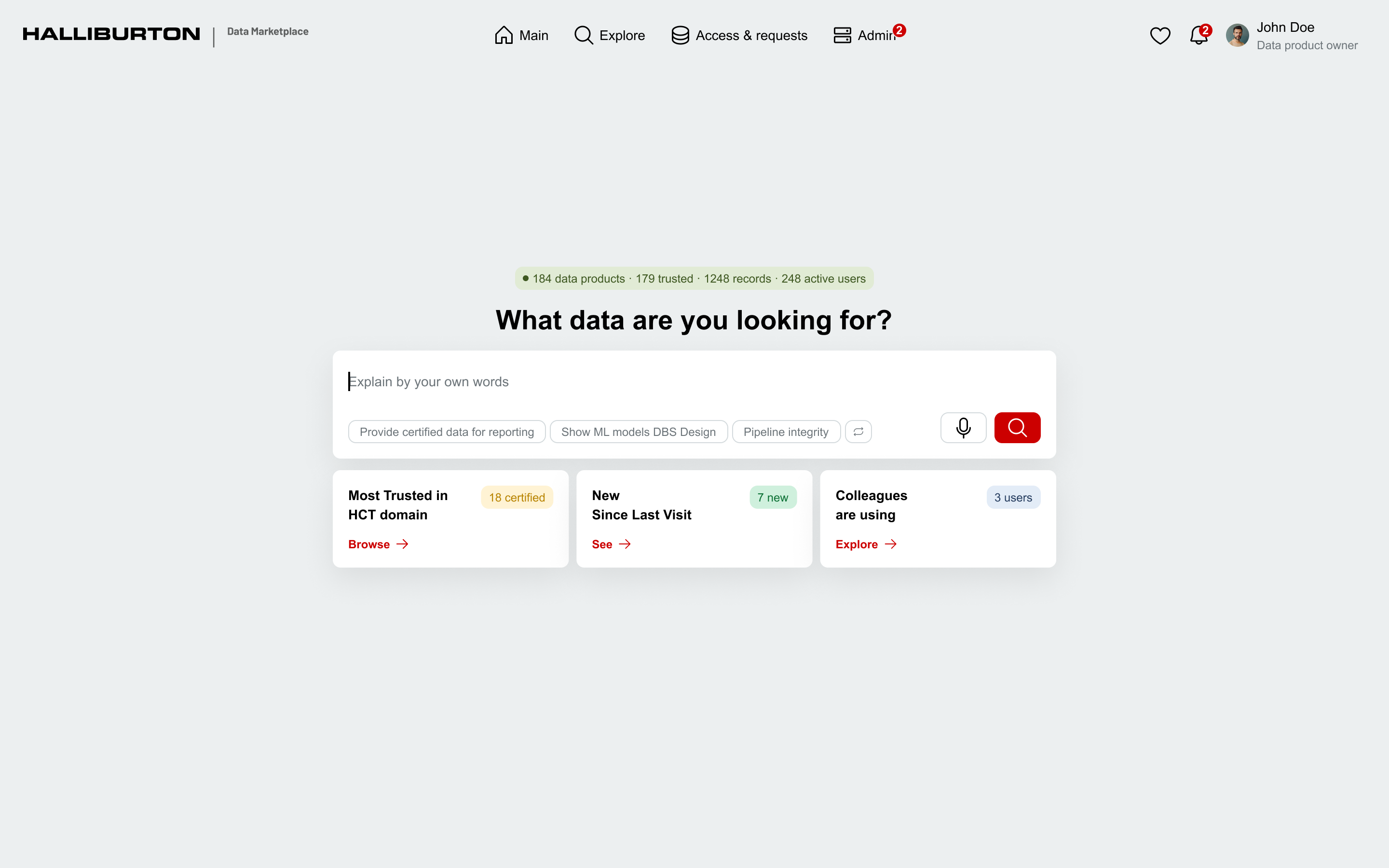
Three-tier token architecture
One system, two themes, zero duplication. Every color flows through three layers — primitives, semantic tokens that swap for light/dark, and component tokens.
primary-background
#CC0000
primary-foreground
#FFFFFF
secondary-foreground
#000000
secondary-background
#ECEFF0
surface-background
#FFFFFF
surface-foreground
#000000
success-background
#CFF0DD
success-foreground
#0C7135
warning-foreground
#A94722
~158 primitive · ~45 semantic · ~459 component tokens across 2 themes.
06 — Validation
Testing with the people who'd actually use it
Before moving to development, I ran two structured feedback sessions with the primary user groups — validating designs, aligning on roles and workflows, and catching blind spots early.
Session 1 — Data POD Leads
Design review with Data POD Leads — the technical owners who create and maintain data products. Validated roles, publishing workflows, and access management.
Key takeaways
- Overall Marketplace concept is supported
- Clear separation between POD Lead and Data Product Owner responsibilities
- Automation-first approach validated
- Access management should be user-centric
- Sensitivity column removed from UI
- Dev access management remains an open exploration topic
Session 2 — Data Product Owners
Design review with Data Product Owners — the business owners responsible for final approval and publication. Validated publication flow, access governance, and role alignment.
Key takeaways
- Overall Marketplace concept is supported
- Clear separation between technical and business ownership
- Access management should be user-centric with clear access reasons
- Publication and access decisions should stay lightweight
- Marketplace enables confident decisions without exposing technical complexity
07 — Hand-off to Dev
AI-powered design-to-code pipeline
Traditional hand-off means screenshots, redlines, and a PDF that's outdated the moment you save it. Instead, I connected developers directly to the Figma design system through MCP (Model Context Protocol) — they pulled specs, tokens, and interaction states straight into their IDE in real time.
How it flows
Figma file
Design system, tokens, variables
→
MCP server
Structured data layer
→
Claude Code / IDE
Live queries from dev environment
→
Production code
Components built 1:1 with design
08 — Post-launch Research
Launch isn't the finish line — measuring what's next
The platform is in active use while testing continues. Rather than waiting to measure success, I designed the post-launch research program upfront — combining analytics, AI-powered tools, and continuous user feedback.
What we'll measure
| Adoption | Active users, onboarding completion rates, and frequency of return visits across all persona groups. |
| Task success | Time-to-find for datasets, search-to-access conversion, and first-attempt success rate for access requests. |
| Satisfaction | In-product micro-surveys and follow-up interviews triggered by key user actions. |
| Pain points | Friction identified through AI-summarized session replays, support tickets, and heatmap analysis. |
Modern research stack
| Analytics copilot | Natural language queries across usage data to spot trends and cohorts faster than manual dashboards. |
| AI session replay | LLM-generated insights from user sessions instead of watching hundreds of recordings manually. |
| Continuous interviews | Weekly short conversations with real users, built into the process rather than run as one-off studies. |
| Feedback synthesis | Combining survey responses, support tickets, and interviews into themed insights automatically via LLM synthesis. |
Feedback-driven iteration
| Listen | Collect feedback through multiple channels — surveys, session replays, interviews, and support tickets. |
| Synthesize | Theme the findings and prioritize by impact on user tasks and business goals. |
| Ship | Iterate on the most critical friction points in fast, focused cycles. |
| Validate | Re-measure to confirm the change actually moved the metric. |
09 — Outcome
Built, validated, in active use
The platform is built, validated with real users, and in active use while testing continues.
Already in place: a three-tier design system, dev-integrated MCP pipeline, two-phase UX strategy, two rounds of stakeholder validation, and a Figma-to-code workflow producing components 1:1 with the design system.
10 — Reflection
What I learned along the way
What I'd do differently
Involve data governance stakeholders earlier in the process. Their requirements only became clear mid-project, which meant reworking parts of the access request flow that were already in motion.
What this project taught me
Leading a project end-to-end as the only designer taught me seniority isn't about headcount — it's about owning decisions across the whole stack. AI in design isn't magic, it's leverage: it speeds up what you already understand and is useless for what you don't. The best outcomes came when I knew exactly what I wanted before asking.
What I'm taking forward
The Figma + MCP pipeline is going into every project from here. Once you've shipped components 1:1 with the design system on the first pass, traditional hand-off feels broken.
Next case →
Rebalancer